What the best co-working office layouts get right
Archilogic helps office providers better understand and visualise their spaces through 3D floor plans, office design simulations and data analytics. Here we look at how office designers and workplace planners can take inspiration from successful co-working spaces.

Fifteen years ago there were two options: you worked in your employer’s office, or you worked at home. But between the tech industry and the gig economy, things have changed. Since the first coworking space opened in (where else) San Francisco in 2005, this sector has exploded , with more than 1,000 locations opening around the world in just the second half of 2018. And while the trend was originally driven by independent workers, at this point, it’s not just for freelancers. In fact, according to research by office furniture manufacturer Knoll , up to half of coworkers are employees. Some large corporations expect to house nearly a quarter of their staff in such spaces within just five years. It makes sense not just for remote workers, but also for large enterprises that want to benefit from the entrepreneurial vibe these spaces deliberately foster. The Knoll research points to the importance of a good workplace to employee satisfaction, and so, to reducing turnover costs. And of course it’s a cost-effective way to manage an on-demand workforce.
But what exactly makes for a great co-working space?
Pushing these spaces as a fix for unhappy workers is intriguing. Are they really so attractive? After all, humans are territorial animals. Hot desking goes against the instinct to mark out your own corner. So how do the best spaces compensate for that in-built disadvantage?
By playing to their strengths. Coworkers typically cite the same key benefits as reasons they love their working environment: the pleasure of engaging with others, and the fresh ideas and opportunities so gained. A great coworking space therefore is one that fosters these interactions.
Some striking points from that Knoll report : coworkers say they are more productive than when working at home or in a traditional office environment – but they also report spending a third of their time away from their desks, and splitting their time equally between focused work, and interacting with others. So the productivity isn’t coming from just keeping eyes on screens and hands on keyboards, but from conversations. Is this the famed watercooler effect in action? And can office spaces be designed to maximise it?
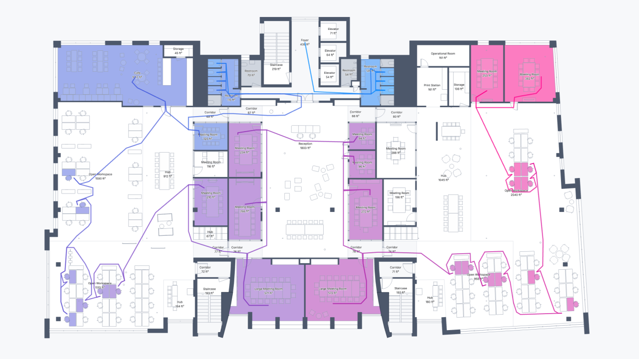
As yet, little research has been done on what users want in a coworking space. However, from a 2018 study published in Building Research & Information, it is clear that office layout is one of their top priorities. In fact, it’s nearly tied with “atmosphere and aesthetics”, and both are outdone only by the accessibility of the location. So although website reviews of these spaces often include comments like “great coffee!”, it seems clear that to win customers, space owners should focus on design. Archilogic is working on a tool to help with effective office layout planning by seeing how design changes affect key variables such as daylight, screen privacy and circulation. You can see a sneak preview here.
The key happiness factors for co-working space
Workers in any space have certain common needs, beyond fast wifi. The best coworking spaces take care to meet these basic needs – and then add something extra.
Let the outside in
Maximising daylight, greenery and other natural elements can do wonders for user wellbeing. Workers will always gravitate to the windows – what can you do to give every desk good natural light? How can you maximise the flow of light to desks further from the edges of the floor plan?
Provide variety and choice
An open layout, with shared desks, provides that vital sense of communal welcome (and good daylight flow). With thoughtful design it should create an exciting impression of stepping into a room full of creative minds at work. Your goal is to inspire and stimulate – make this core area a vibrant hub of activity!
But when it gets too noisy or distracting, quiet corners will be valued. Ideally this means both calmer public areas (using screens or high-backed, cocoon-style seating can do a lot to make this work) and properly closed off silent booths for maximum focus or important calls.So you’ve got big desks and private corners; don’t stop there. Offering users built-in variety (and the chance for a change of scenery in the middle of their day) is where coworking spaces can really shine. If you have the space, consider creating working areas with different atmospheres.
Don’t forget we’re social beings
Even if space is tight, remember the importance of interaction, and make your social areas plentiful and inviting. Think beyond the cliché of ping pong tables and beanbags, and consider your industry niche (if any). What would make your ideal users feel at home? What would encourage them to engage with each other?
On that note, remember the kitchen isn’t just for getting coffee. 25N noticed that users in their Geneva site gathered around the corners of counters in the café area – so in their next location, they created an enormous island with extra corners.
There’s no magic formula, but balancing the needs for light, privacy and community is a solid first step in designing the optimal layout for a coworking space. The way things are going, we might all be using coworking spaces pretty soon; so let’s get them right.
Do you use coworking spaces for yourself or your employees? Tell us about it or ask our team your questions on this growing trend and how technology can help optimize it. hello@archilogic.com

 Share
Share


